Professional Portfolios:

Spritework Marketing Logo Design

Jordan Durci's Logo Design Portfolio

My passion for logo design began while I was in highschool. Back in those days, I ran a Pokémon-centric news page on Google+ (back when that was a thing). Back then, I used PowerPoint to create logos that I thought looked cool, granted, looking back, they were often pretty rough, but what highschooler's work isn't still a little rough around the edges?

I've come a long way since then, and have begun to truly hone those skills into ones that I can now use to create logos for projects that aren't just my own.

DurchBurch Logos

2016

Stacked Logo

The first official DurchBurch logo.  It makes use of a stacked structure where the top half of the B is initially read as a D, but the full B is read when reading the lower half of the stack.

Small Logo

The smaller version of the first official DurchBurch logo.  It's simply the letters DB in the same fontface as the stacked logo.
These two logos are the original DurchBurch logos from 2016. The black and red color scheme was admittedly edgy for my personality, and the rune-like fontface was, likewise, a bit gritty. Those issues aside, I'm still quite proud of my execution on the idea to stack "urch" twice and read a modified B in two different ways. It was an interesting idea, whether or not the design stuck around.

2018

Slashed Logo

The second official DurchBurch logo.  It makes use of a simpler DB with a slash breaking up the center.
This logo symbolized change for my brand. My significant other at the time expressed concerns that my old branding failed to convey my big, happy personality, offering only a glimse to apparent edge and darkness. At that time, I was really itching to create a broken or slashed logo design anyway, and thought that rebranding myself to have less edge, breaking that dark face I pushed onto my channel, could work with such symbolism. This logo is when my branding first adopted the color scheme it now uses, as I wanted to avoid the brooding red and black combination.

2019

Interlocked Logo

The third official DurchBurch logo.  It makes use of an interlocked DB with a blue circle behind the letters and a white stroke providing an almost stickerlike appearance.
This logo was came as a result of necessity, but also came as a result of comfort and acceptance with my new branding. In Fall 2018, my computer's main hard drive crashed, and with it, I lost all of my old branding (what you've seen above was scavenged from around the internet, luckily still at original quality). I was really happy with my previous branding, but thought that I could still do more to decrease the dark tones from the original design. I wanted to embrace the personality I strove to give off, and so I drew up an interlocked D and B, creating an embrace between the letters. I also made the blue color introduced in the slash of the 2018 logo much more important, making a large circle to fill the space behind the letters. I also knew that I wanted to bring in something to tie it all together, as well as a 4th color, and so I settled on stroking the outside of the logo in white, creating a sticker-like cohesion, something you'll see that I took quite a liking to as you look deeper into this portfolio.

2023

Entangled Logo

The fourth official DurchBurch logo.  It also makes use of an entangled DB with a blue circle behind the letters and a white stroke behind the letters for increased contrast and another stroke outside of the circle providing an almost stickerlike appearance.
After using the 2019 logo and branding for four years, I felt the need to spruce things up a bit and revitalize my branding. There were some aspects of the logo that I really liked and felt that I couldn't remove or change significantly, but there were some aspects that I'd grown to like less over time and I felt this would be a prime opportunity to improve those areas. The first part I set to was creating thicker, bolder letters for the logo and increasing the size of the circle to fully encompass the letters, positioning them to fit nicely in the circle, rather than having them truly centered. I also added a white stroke around the letters themselves to increase their contrast in relation to the blue. There was some consideration around the colors, but, in the end, I decided not to change them. Something I was aiming for with this newest logo and the branding overall is increased contrast, and an upped focus on white being the fourth color associated with the brand by using it in the places that I'd previously utilized the blue, as a divider between blocks of color and an accent color for the branding on the whole.

Board Brains Logos

2018

Double Diamond Logo

The first official Board Brains logo.  It simply features the words Board Brains on a squashed diamond background with a smaller, even more squashed diamond at the center.
Starting in 2018, I began to play board games with several friends as livestreamed content on the DurchBurch channel. I wanted to have a logo that would be fun and wacky, so I chose a loose and crazy font and vibrant teal and purple colors, one of my favorite retro color combinations. The choice to add the diamond to the background was made to evoke a sense of looking at a square boardgame on a tabletop, though the decision to add the second at the center was made to simply fill some empty space, though it is notably similar to the slashed DurchBurch logo that would come to be used on the channel not long after this logo was made, showing how early that concept began brewing.

2019

Brain Logo

The second official Board Brains logo.  It features larger text saying Board Brains over a squashed diamond.
With the loss of my old assets on my hard drive, the Interlocked DurchBurch logo wasn't the only new piece of branding to be made. Board Brains also needed a new logo. Taking cues from the new DurchBurch logo, I wanted to make it more vibrant, as well. This resulted in a flipping of which color was more vibrant, and the creation of a shape that was more fun. While the font used is less loose, the text is meant to evoke a brain, befitting the title of the streams, and the diamond motif was preserved in the background.

Miscellaneous Logos

The following logos are all from projects that weren't heavily tied to my channel's branding as well as logos that are wholly unrelated to my channel.

2019

Locus Operandi Logo

The official Locus Operandi tabletop logo.  It shows a reticle set on a D20 between the words Locus Operandi.
This logo was for the homebrewed tabletop I workshopped with my friends for Board Brains. The game typically uses D20 dice to track a valuable tool in the game called Plot Points which can be used by players to define the world of the game. The reticle was meant to suggest the focus of the game being on the D20, and, therefore, the Plot Point.

2020

Clothing Unrelated Store Logo

My logo for Clothing Unrelated.  It features the word clothing on one line, and unrelated below, distorted into trapezoids so that the words pull towards the center of the logo.
This logo was made for Clothing Unrelated, my second Teespring merch store, and the one that is not tied to my channel. As it's a space for clothing that I just think is cool sounding or experimental, I wanted a logo that felt unique and cool, while also breaking its seriousness down with subtle goofiness in the side text, which references the emoticon "OwO" indicative of a shocked expression on a cute face.

Infinite Fusion Series Logo

My logo for my Infinite Fusion stream series.  It features the title Infinite Fusion arranged based on the custom ball sprite I use in game.
This logo was used for my series where I streamed a Pokemon fangame called Infinite Fusion. For my streams, I'd made many custom assets, and, as the game had no official logo, I created one based on my custom ball sprites.

Art of Pieces Logos

My logo for my mother's art brand Art of Pieces.  It features lettering based on her broken glass art and her calligraphy that reads 'Art of Pieces'.
My square logo for my mother's art brand Art of Pieces.  It features lettering based on her broken glass art reads 'AP'.
These logos were made for my mother's art brand Art of Pieces, with the long one as the full length logo, and the AP as one used for social media profiles. Her art heavily features broken glass, which has at many times been used for lettering. The A and the P from these logos, as well as the heart in the first, are based on actual shards of glass that feature letter-like and heart-like forms, and the P features another aspect of broken glass she looks for, which she calls facing (instances where the broken edge of a piece of glass resembles a facial profile). The calligraphy featured in the longer logo is based on the calligraphy she often includes in her pieces, and was one of her requests for the logo, as she thought having it present along with the broken glass lettering would better highlight what she wants Art of Pieces to be.

2021

Shaun the Bear Logo

The official shaunthebear Twitch and YouTube channel logo.  A bear paw with the symbol for earth on the palm.
This logo was made for my oldest brother's Twitch and YouTube channel. It's based on his shoulder tattoo, which he designed himself as a bear paw with an earth symbol on the palm. It was designed to be simple and flexible while clearly indicating his brand.

Pokémon News Logos

The long version of the logo I designed for an admittedly out of use Facebook page that I'm the admin for, Pokémon News.  The P is a Poké Ball.'.
The squared version of the Pokémon News.  This one only features the Poké Ball P and the N from news.
These logos were designed for Pokémon News, which is a Facebook page that succeeded a Google+ page that I used to run. During a small burst of inspiration to revive the on-indefinite-hiatus Facebook page last fall, I created these new logos, though I ultimately came to realize that it was resulting in spreading myself too thin by continuing to run it, as it's unrealistic for me to maintain the Pokémon News page, work, my personal YouTube channel, and still have room for recreation, friends, and family, so it's been sidelined for the time being, once again.

2022

MegaCube Logo

A logo designed for the so-called MegaCube, a large square configuration of corner desks creating a cubicle like structure with four distinct workers.
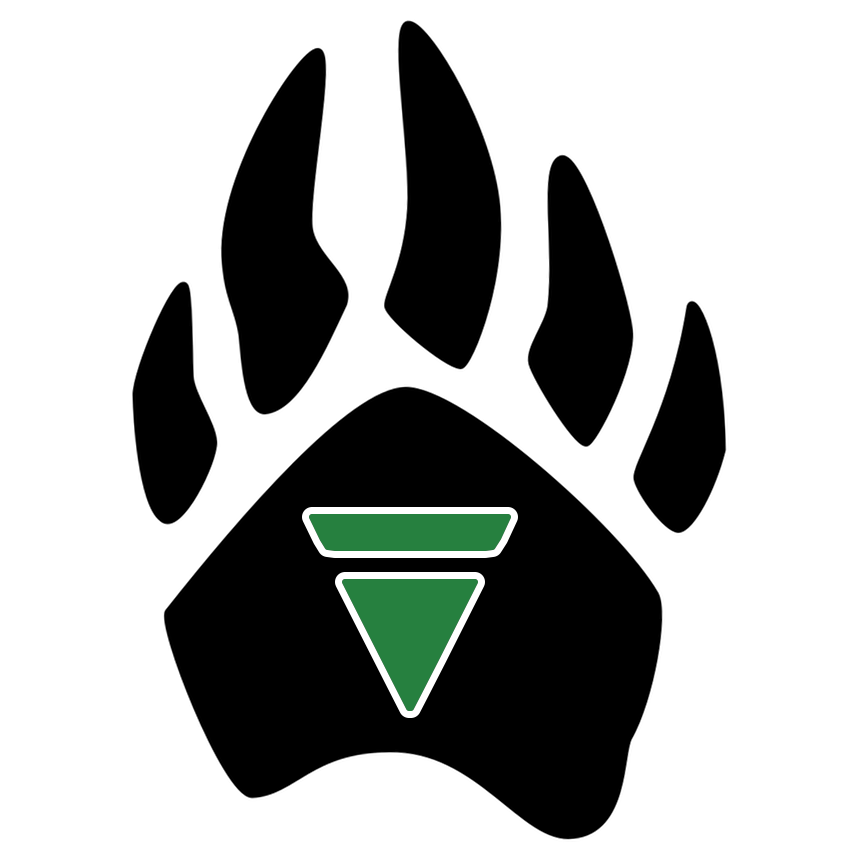
This one's admittedly kind of a joke. In Fall of 2021, my office was changed, and with it, I was placed in a new workspace. In this new workspace, I was seated at a desk in a structure made up of square bracket-shaped walls that looked roughly like this (but admittedly more square that it can display here): [ ]. In each of the corners of the walls, is a desk with a counterlike length of usable deskspace stretching along the wall and connecting the desks. Starting in early 2022, I jokingly called it the MegaCube to a coworker, and he, being a far more extroverted person than I, took it and ran with it, popularizing the word as the go-to term for our group of desks. For a while, I'd mulled over ways to make the MegaCube stand out even more, and this was my most actualizeable idea for how to do that. I designed this logo to make desk magnets for everyone in the MegaCube so that, even though it won't last forever, the MegaCube will always live on wherever they can slap a magnet.